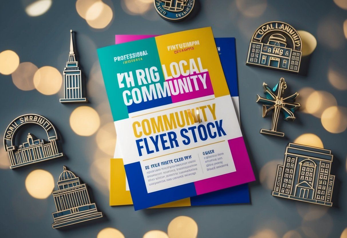
Design Tips for Effective Flyers That Attract Local Customers: Key Strategies for Success
Designing effective flyers is a powerful way to attract local customers. A well-designed flyer should grab attention and clearly communicate the message to the target audience.
Using simple visuals and clear text can make a significant impact on how customers perceive a business.
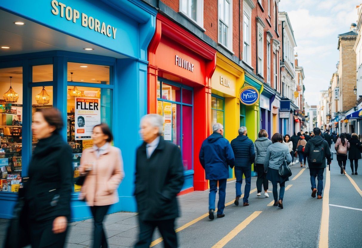
Choosing the right colors and images is essential for creating a flyer that stands out. Coupled with an engaging headline, this approach can draw potential customers in and encourage them to read more.
Flyers are not just paper; they are tools for effective advertising that can drive local business success.
By focusing on key design elements, businesses can create informative and appealing flyers. This can help convey their brand identity and persuade local customers to take action.
Key Takeaways
- Know your audience to craft an appealing message.
- Use eye-catching visuals and headlines to draw attention.
- Include a clear call-to-action to encourage customer engagement.
Understanding Your Target Audience
Knowing the target audience is key to creating effective flyers. Recognizing who they are allows for tailored messages that resonate. Engaging with them helps ensure the flyer reaches the right people.
Tailoring Your Message
To connect with the target audience, the message must be specific to their needs and interests. Consider age, income, and lifestyle factors.
A flyer for a local gym will use different language compared to one for a retirement community.
Using simple language is important. Avoid technical jargon that may confuse readers.
Highlight benefits that are relevant, such as special promotions or local events. This clear communication helps create interest and encourages action.
Visual elements also play a role. Images and colors should appeal to the target group.
For example, bright colors might attract younger customers, while soothing tones may appeal to older individuals.
Research and Engagement
Research is crucial for understanding the target audience. Surveys, social media insights, and local market studies can provide valuable data.
Analyzing this information helps to identify trends and preferences.
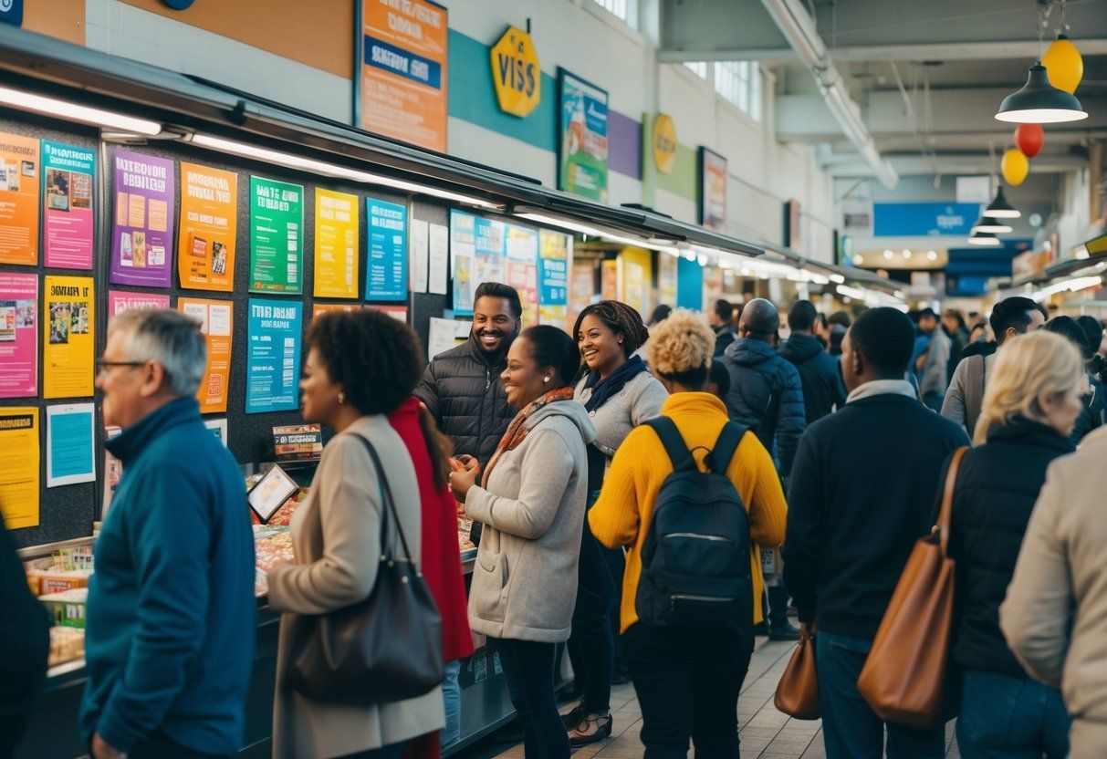
Engagement with the community can also help in understanding needs. Attend local events and interact with potential customers.
This face-to-face communication builds relationships and offers insights about what drives their decisions.
Gathering feedback on existing flyers or services can guide future designs. It’s essential to keep updated on community interests. This ongoing research and engagement create a stronger connection with the target audience.
Key Elements of Flyer Design
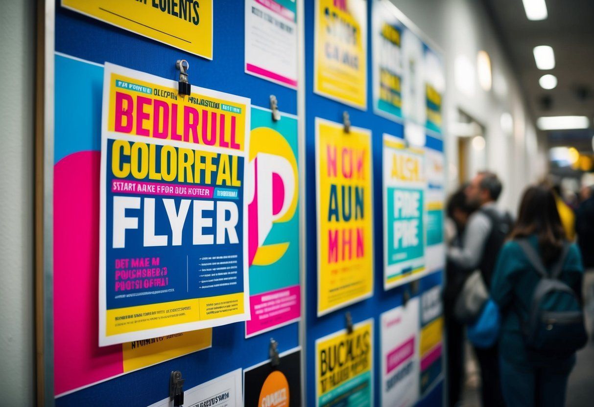
Effective flyer design relies on several important elements. These include typography, color choices, and the use of imagery and visuals. Each plays a crucial role in attracting local customers and conveying the intended message clearly.
Impactful Typography
Typography is essential in flyer design. Choosing the right fonts can make a big difference.
- Font Style : Use bold, easy-to-read fonts for headlines.
- Font Size : Ensure the most important information is larger than other text.
- Hierarchy : Organize text by size and weight to guide the reader’s eye.
Using too many font styles can confuse the reader. Stick to two or three complementary fonts for a clean look.
Using Colors Strategically
Colors set the mood and grab attention. Select a color scheme that matches the brand and message.
- Contrast : Use contrasting colors for text and background to enhance readability.
- Brand Colors : Incorporate colors that represent the business to create recognition.
Avoid using too many colors, as this can be distracting. A balanced palette of 2-4 colors works well.
Incorporating Imagery and Visuals
Images make flyers more appealing. They should relate to the content and support the message.
- Quality : Use high-resolution images to look professional.
- Relevance : Choose images that reflect the business or service.
Visuals like icons can simplify complex information. They help in breaking up text and leading the reader’s eyes through the flyer.
Crafting an Attention-Grabbing Headline
An effective flyer starts with a strong headline. This is the first thing people see and should grab their attention quickly.
Key Tips for a Great Headline:
- Be Clear and Direct: Use simple words to convey the key message. Avoid confusion by stating exactly what is offered.
- Use Action Words: Words like “Get,” “Try,” or “Discover” motivate action. They encourage readers to engage with the flyer.
- Keep it Short: A headline should be concise. Aim for fewer than 10 words to make it easy to read at a glance.
- Make it Relevant: Tailor the headline to the target audience. Local customers will respond better if the message connects to their needs or interests.
- Create Curiosity: Phrases that spark interest can draw readers in. For example, “Unlock Special Deals Inside!” invites them to learn more.
Examples of Strong Headlines:
| Type | Headline Example |
|---|---|
| Promotion | “Save 20% on Your Next Meal!” |
| Event | “Join Us for Family Fun Day!” |
| Service Offer | “Book Your Free Consultation Today!” |
Using these tips can help create a headline that effectively attracts local customers. A well-crafted headline leads the way to a successful flyer.
Creating a Compelling Composition
A well-structured flyer combines clear focus and thoughtful use of space. It guides the viewer in a way that highlights the important parts. Balancing these elements can greatly enhance the impact of a flyer.
Designing Around the Focal Point
The focal point is the main feature that grabs attention. It can be a striking image, catchy headline, or a unique offer. To create an effective focal point, use contrasting colors or larger fonts. This helps it stand out from other elements.
Visual hierarchy plays a role here. Important information should be placed near the top or center of the flyer. This draws the eye naturally. Also, limit the number of focal points to avoid confusion. Having too many competing elements can dilute the message.
Leveraging White Space
White space, or negative space, is the unused area around design elements. It helps prevent clutter and makes a flyer easier to read. Effective use of white space can lead to a more balanced composition.
To leverage white space, avoid crowding text and images. Leave breathing room around the focal point and other key elements. This enhances focus and guides the viewer’s attention where it matters most.
Remember, white space can also create a more polished look. A clean design can attract more customers by appearing professional.
Enhancing Branding and Identity
Creating effective flyers involves strong branding and a clear identity. This connection helps local customers recognize and trust a business. Two important areas to focus on are brand consistency and the use of custom illustrations.
Brand Consistency
Brand consistency ensures that every flyer reflects the same look and feel as other marketing materials. This includes using the same colors, fonts, and logos. When a brand is consistent, customers quickly recognize it.
Businesses should choose a color palette that reflects their identity.
For example, a lively coffee shop might use warm colors like orange and brown. Alternatively, a tech company may opt for cool blues and grays.
Using the same fonts in all advertising builds familiarity.
It is helpful to select one main font for headlines and another for body text. This creates a cohesive and professional appearance across all flyers.
Custom Illustration and Elements
Custom illustrations can make flyers stand out. They add a unique touch that helps convey a brand’s message clearly.
Rather than using stock images, custom designs reflect the brand’s identity more accurately.
Illustrations can highlight key aspects of a product or service. For instance, a gym could use illustrations of people working out to promote fitness classes.
Incorporating design elements like icons or patterns can also enhance visuals. These small details draw attention to important information. A well-designed flyer not only looks attractive but also reinforces brand identity, making it memorable for local customers.
Effective Use of Call-to-Action
A strong call-to-action (CTA) is key for effective flyers. It tells customers what to do next. Clear and direct CTAs guide the reader’s response.
Using action words is important. Phrases like “ Call Now,” “ Visit Today,” or “Sign Up” encourage immediate action. These words create a sense of urgency, making customers more likely to respond quickly.
CTAs should stand out visually. Use bold fonts, bright colors, or boxes to grab attention.
Position the CTA near the flyer’s bottom or end to catch the reader just before they finish.
Contact information is critical. Place it close to the CTA for easy access. Include a phone number, website, or social media handle. This way, customers can quickly reach out.
Examples of Calls-to-Action:
| Action | Purpose |
|---|---|
| Call Now | Immediate response |
| Visit Us | Drive foot traffic |
| Get 20% Off | Incentivize purchase |
A call-to-action should create excitement. Phrasing like “Limited Time Offer!” or “Join the First 50!” can motivate customers to act fast.
Lastly, test different CTAs to see what works best. Changing wording or design might lead to better results. This can help in figuring out how to attract more local customers effectively.
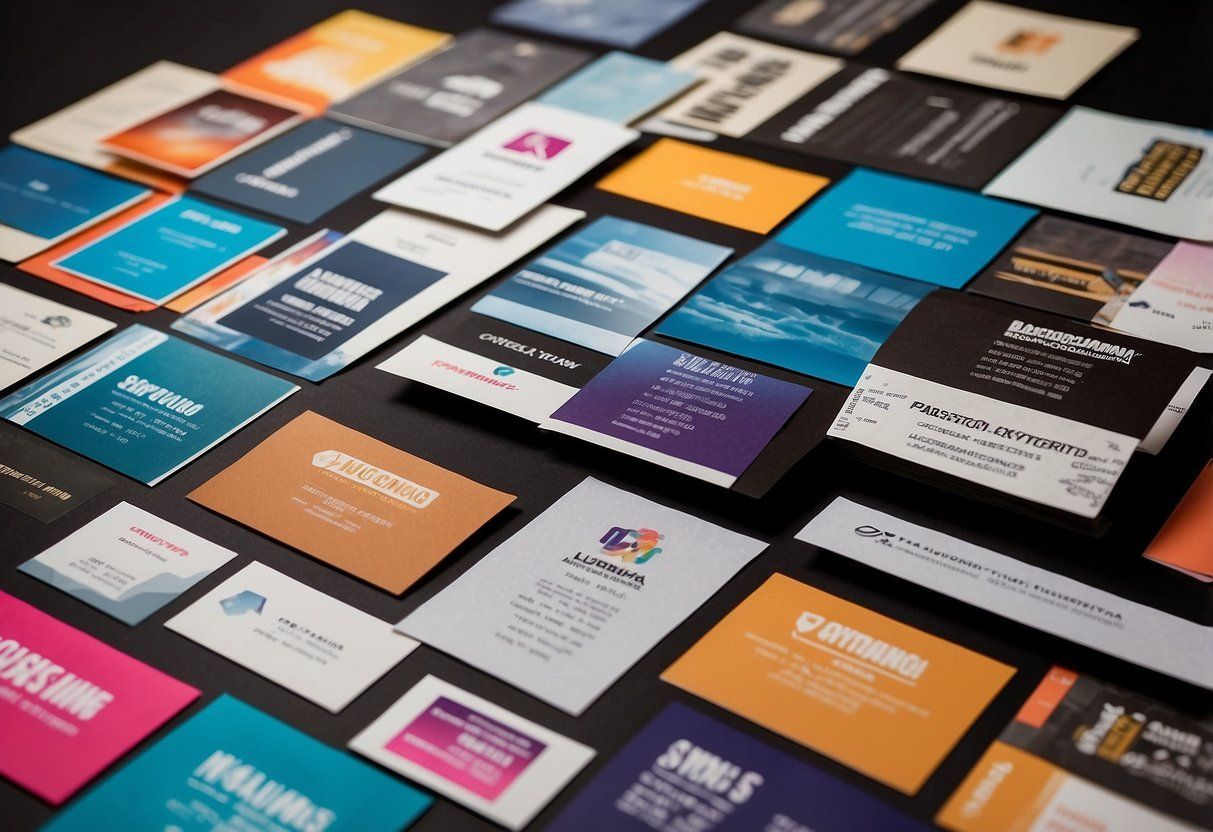
Selection and Customization of Flyer Templates
Choosing the right flyer template is crucial for grabbing attention. Customizable templates offer flexibility and can align closely with brand identity. These templates help create a strong connection with local customers.
Benefits of Customizable Templates
Customizable templates allow for specific adjustments to suit individual needs. They provide a foundation that can be modified regarding color, layout, and images. This flexibility ensures that businesses can reflect their unique style and vision.
Using customizable templates also saves time. Instead of starting from scratch, one can focus on tweaking an existing design. This approach reduces the workload while still allowing for a personalized touch.
Many online platforms offer a range of templates that cater to different themes and industries.
Another advantage is consistency in branding. A well-chosen template helps maintain a coherent look across all marketing materials. This reinforces brand identity, making it easier for customers to recognize a business.
Choosing the Right Template for Your Brand
Selecting the right flyer template requires careful consideration of brand identity.
Businesses should assess their values, target audience, and overall message before making a choice.
The template should reflect these aspects clearly.
Colors play a significant role in template selection.
Each color evokes different emotions and can influence perception.
For example, blue often conveys trust, while red can create a sense of urgency.
The layout of the template is equally important.
It should guide the viewer’s eye to the most critical information, such as sales or events.
A clutter-free design enhances readability and engagement.
Finally, businesses should choose templates that allow for images and logos.
Including branded visuals strengthens recognition and recall.
Customizing a template to fit these features will help attract local customers effectively.
Flyer Content Essentials
Effective flyer content combines text and visuals, ensuring the message is clear and easy to read.
Key elements include maintaining a balance between images and words, ensuring everything is readable, and including essential contact details.
Balancing Text with Visuals
The right mix of text and visuals can draw attention and convey a message quickly.
Using images can break up large blocks of text and add visual interest. This engages the viewer and keeps them reading.
Text should complement images, not overwhelm them.
For instance, use short headlines and bullet points to communicate key information quickly.
A well-placed graphic or photo can illustrate a point without needing many words.
Think about a 50/50 ratio of text to images for ideal impact.
Ensuring Readability and Clarity
Readability is crucial for effective flyers.
Text should be clear and easy to read . Using large fonts can help.
Recommended font sizes range from 14 to 18 points for the body and larger for headings.
Choose fonts that are simple and legible , avoiding fancy styles that can confuse readers.
High contrast between text and background improves visibility.
Limit the number of font styles to two or three for a cohesive look.
White space is also important; it helps to avoid clutter and separates different sections easily.
Importance of Contact Details
Contact details are vital on any flyer. Including this information allows interested customers to reach out easily.
Key contact details include a phone number , email address , or website link .
Place these details prominently, ensuring they are not buried in fine print.
A common practice is to position contact details at the bottom or in a corner of the flyer.
Make sure the information is accurate and up to date. This simple step can increase the chances of gaining new customers.
Design Techniques and Tools
Effective flyer design relies on specific techniques and tools.
Using grid layouts helps organize content clearly. Experimenting with colors enhances visibility. Achieving high-quality print ensures the flyer looks professional and attracts attention.
Using Grid Layouts
A grid layout is essential for creating a balanced flyer. It divides the space into sections, making it easier to organize text and images. This structure allows for a clear flow of information.
- Alignment : Aligning elements within these grids makes the flyer look more professional.
- White Space : Adequate white space around text and images prevents clutter. This helps the viewer focus on key details.
Graphic design tools like Adobe InDesign or Canva offer grid templates to simplify this process. They provide flexibility in placing elements while maintaining structure.
Experimenting with Contrasting Colors and Gradients
Contrasting colors grab attention and improve readability. Use a bold color for headers and a softer one for body text. This creates visual interest.
- Color Wheel : Utilizing complementary colors ensures the flyer stands out.
- Gradients : Gradients can add depth and modern appeal. They blend two or more colors, creating a stylish look.
Be mindful of color choices. Too many contrasting colors can overwhelm the reader. Stick to a limited palette that reflects the flyer’s message and branding.
Achieving High-Quality Print
Printing quality can significantly impact the flyer’s effectiveness.
Use high-resolution images and graphics to ensure sharpness.
- Resolution : Aim for 300 DPI (dots per inch) for printed materials. This guarantees clarity.
- Paper Type : Choosing the right paper enhances the flyer’s feel. Glossy paper can make colors pop, while matte may give a more sophisticated look.
Before printing, review a test copy to check colors and layout. This final step can prevent costly mistakes and ensures the final product meets expectations.
Maximizing Impact with a Marketing Campaign
Creating an effective marketing campaign requires planning and strategy. First, it’s important to define the goal . Is it to increase sales, boost brand awareness, or engage the community? This guides all other actions.
Next, explore different advertising channels.
Flyers can be combined with social media, emails, or local events. This mix expands reach.
Engagement is key. Use interactive elements in flyers, such as QR codes. This encourages customers to learn more or participate in promotions.
Consider the timing of the campaign. Launching at local events can increase visibility. Aligning the campaign with holidays or community gatherings can draw more attention.
Target the audience effectively. Knowing who the customers are helps in designing messages that resonate.
Tips for Creating Impactful Flyers:
- Bold Headlines : Grab attention quickly.
- Clear Calls-to-Action : Tell customers what to do next.
- Visually Appealing Design : Use colors and images that reflect the brand.
Lastly, measure the success of the campaign. Track responses from each advertising method. This feedback helps improve future efforts.
Frequently Asked Questions
Designing flyers that attract local customers involves understanding key elements, creating standout designs, and employing effective communication strategies. Below are common questions and their answers to help in creating impactful flyers.
What are the key elements of designing a flyer that captures local customer interest?
Key elements include a clear headline that grabs attention, concise content that conveys the message, and a strong call to action. Using local references can make the flyer more relatable. Also, ensure contact information is easy to find.
How can you create a flyer that stands out and gets noticed?
Using bold colors and unique fonts can help a flyer stand out. Engaging images or illustrations can draw the eye. Keeping the layout clean and organized makes the flyer easy to read.
What strategies can be employed to ensure your flyer effectively communicates your business message?
To communicate effectively, use straightforward language and avoid jargon. Focus on the benefits of the product or service. Bullet points can help highlight important information quickly.
What are some best practices for using graphics and visuals in business flyers?
Graphics should support the message and not overwhelm it. Choose high-quality images that are relevant to the content. Ensure there is enough white space to keep the layout balanced.
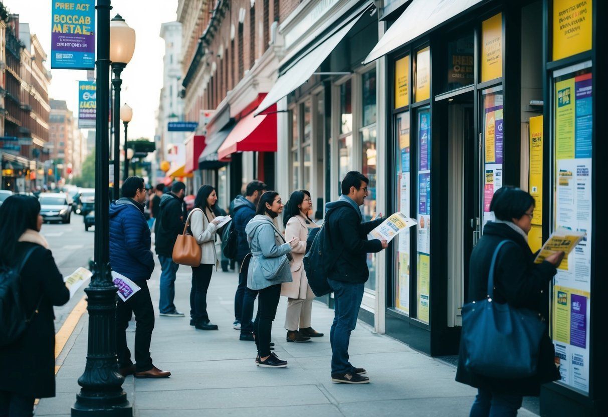
How can the distribution of flyers be optimized to increase local customer engagement?
Choosing high-traffic locations for distribution can enhance visibility. Consider local events or partnerships with nearby businesses. Engaging local influencers to share the flyer can also boost reach.
What are some cost-effective ways to design professional-looking flyers?
Use free or low-cost design tools available online.
Templates can provide a professional layout without the cost of a designer.
Printing in bulk can reduce costs per flyer, making it more affordable.…